In a world that’s getting more computerized every day, it may sound a little crazy to suggest that something should be done on paper when digital solutions have been developed (e.g., Balsamiq, OmniGraffle). Digital wireframes are great. They’re easy to share with co-workers, they look professional, and they’re fun to make. While I’m a big fan, I’ve found that starting with pencil and paper, or marker and whiteboard, results in a higher quality wireframe. Here’s why:
- It’s a quicker way to get your ideas into a form that you can look at and tweak.
- You can easily work through different variations by erasing or crossing something out, or flipping over the paper and starting again.
- It enables you to see an entire user flow in one view to visualize everything working together before making more detailed wireframes of each screen.
- It’s the fastest way to get feedback from a co-worker, which could result in a quick iteration or scrapping the whole thing and starting over.
By the time you’re ready to digitize what you’ve done on paper, you will have thought through the core goal(s) that you were trying to accomplish and worked through issues that you discovered along the way. Then, you can focus on any final adjustments once its digitized before handing it off to the next person in the development process.
Example
I came up with a ‘question of the day’ app for a simple example to use here. Depending on which out of the multiple choice answers the user selects, they’d see a different result. Here’s how I sketched it on paper:
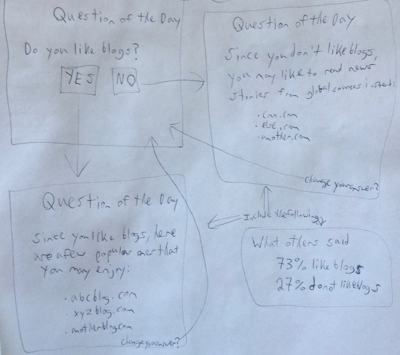
It’s sloppy, but it’s a sketch (and I also have sloppy handwriting). Remember, the goal is to quickly reach a point where you can rethink the idea, or to get feedback from others, resulting in a better version.
When I was in the middle of the above sketch, I thought it’d be good to include a “change your answer” option, so I added one at the bottom right of each answer screen. Clicking on this would send the user back to the question so they could choose a different answer. I didn’t need to resize anything to fit this in — I just added it in the corner, and it’d look better in the next version of the wireframe.
When I finished the sketch, I thought it’d be good to show what other people had selected as their answers, similar to poll results. I couldn’t fit that into the answer screens that I had sketched, so I added a representation of it at the bottom right of the paper (and I would explain this to whoever I shared the sketch with). It could turn out that the poll result feature doesn’t make sense to include, or at least not in the MVP, so it could have been scrapped anyway. As long as it was sketched in some form, it was ready for a discussion or a decision.
Depending on who you work with and what they do in their job function (i.e., some designers and product managers handle different things and have different processes), you may find that all you need to do is deliver a sketch and have someone else run with it. Or you may be the person who receives a sketch and needs to make it better. Whatever the case, I’ve found that step 1 being on paper gets you there in a better way.